


By Mino Area
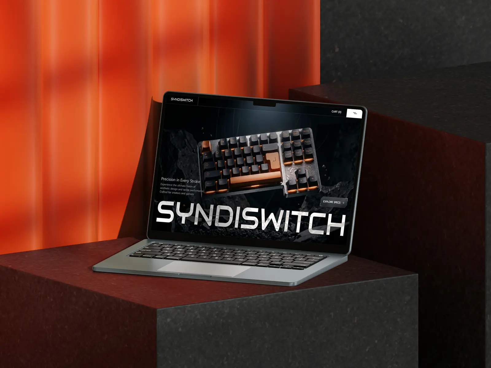
SYNDISWITCH: A high-end Framer template for tech startups. Featuring a sleek industrial aesthetic, immersive scroll-triggered motion, and seamless Shopify integration. Architect your digital gateway and convert visitors into customers with precision design.
SYNDISWITCH is a high-impact Framer template built for forward-thinking startups and product-focused businesses that require a powerful online presence. Combining a bold, industrial visual style with precisely structured layouts, this template is crafted to elevate your physical products into a compelling and immersive digital experience.
Engineered for performance, SYNDISWITCH incorporates advanced scroll-activated animations and dynamic micro-interactions that immediately capture visitor attention. Every motion and transition is carefully designed to lead users through your product narrative, deepening engagement and driving measurable improvements in conversion rates.
With native Shopify connectivity, SYNDISWITCH delivers a reliable e-commerce backbone that streamlines inventory control and sales operations. Whether you are introducing a flagship hardware product or growing a technology startup, the straightforward Framer interface lets you tailor every element — from fonts to intricate grid systems — without writing a single line of code.
Whether you are building a premium brand identity or disrupting an entire industry, SYNDISWITCH offers the dependable, future-ready foundation required to make a lasting impact in today’s competitive digital landscape.
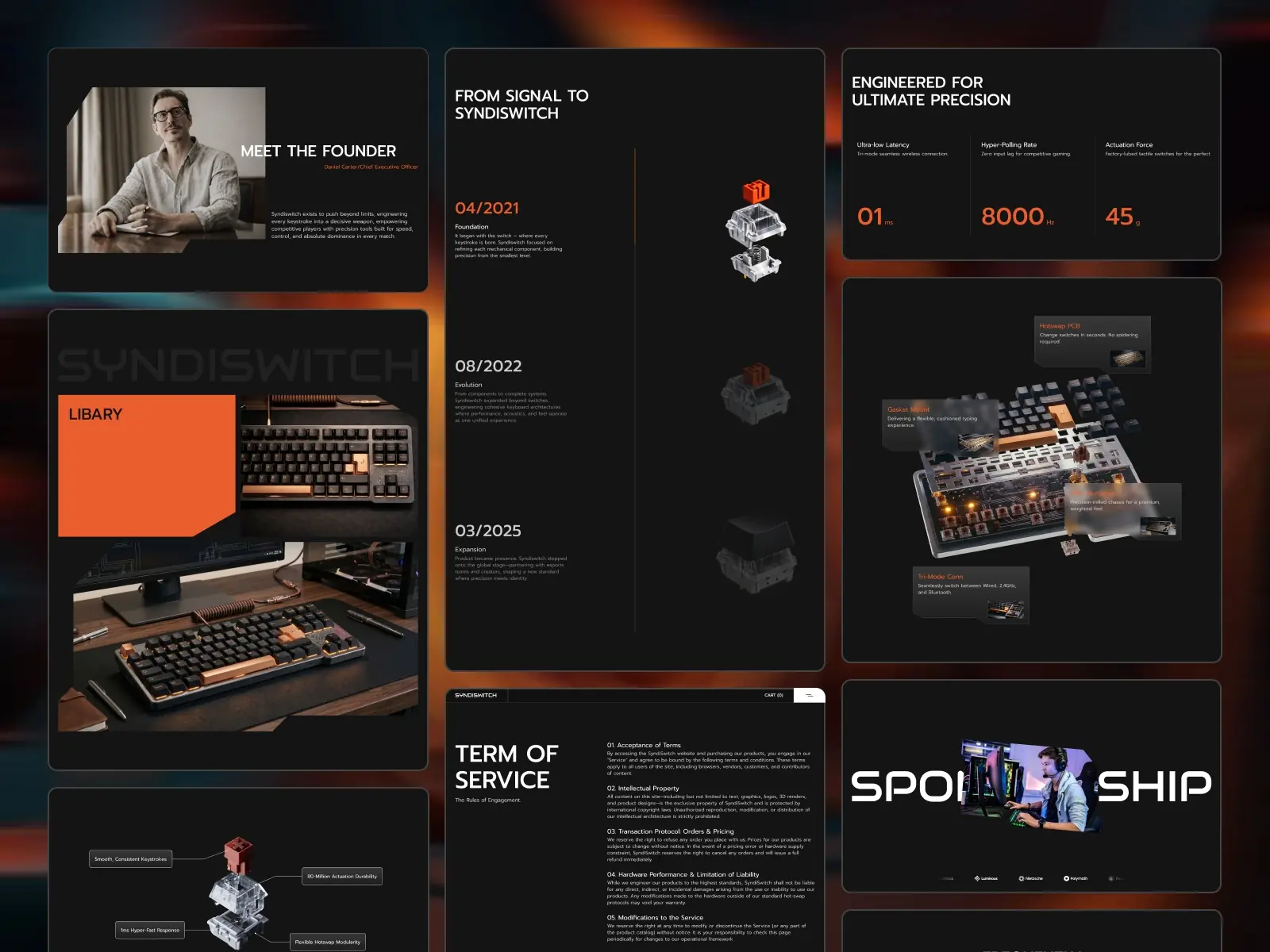
**High-End Visual Design:** Polished, tech-forward aesthetics featuring industrial tones and clean minimalist grids.
**Motion Optimized for Conversions:** Advanced scroll-driven effects and interactive elements engineered to improve user retention.
**Native Shopify Integration:** Enterprise-level e-commerce functionality for smooth product listings and order management.
**Launch-Ready Page Layouts:** A full suite of pre-designed pages including Home, Product Detail, About, and Contact.
**Fully Responsive Framework:** Flawless display and performance across every screen size, from smartphones to ultra-wide monitors.
**Framer-Powered Flexibility:** Completely customizable through an intuitive drag-and-drop interface built for fast deployment.


